
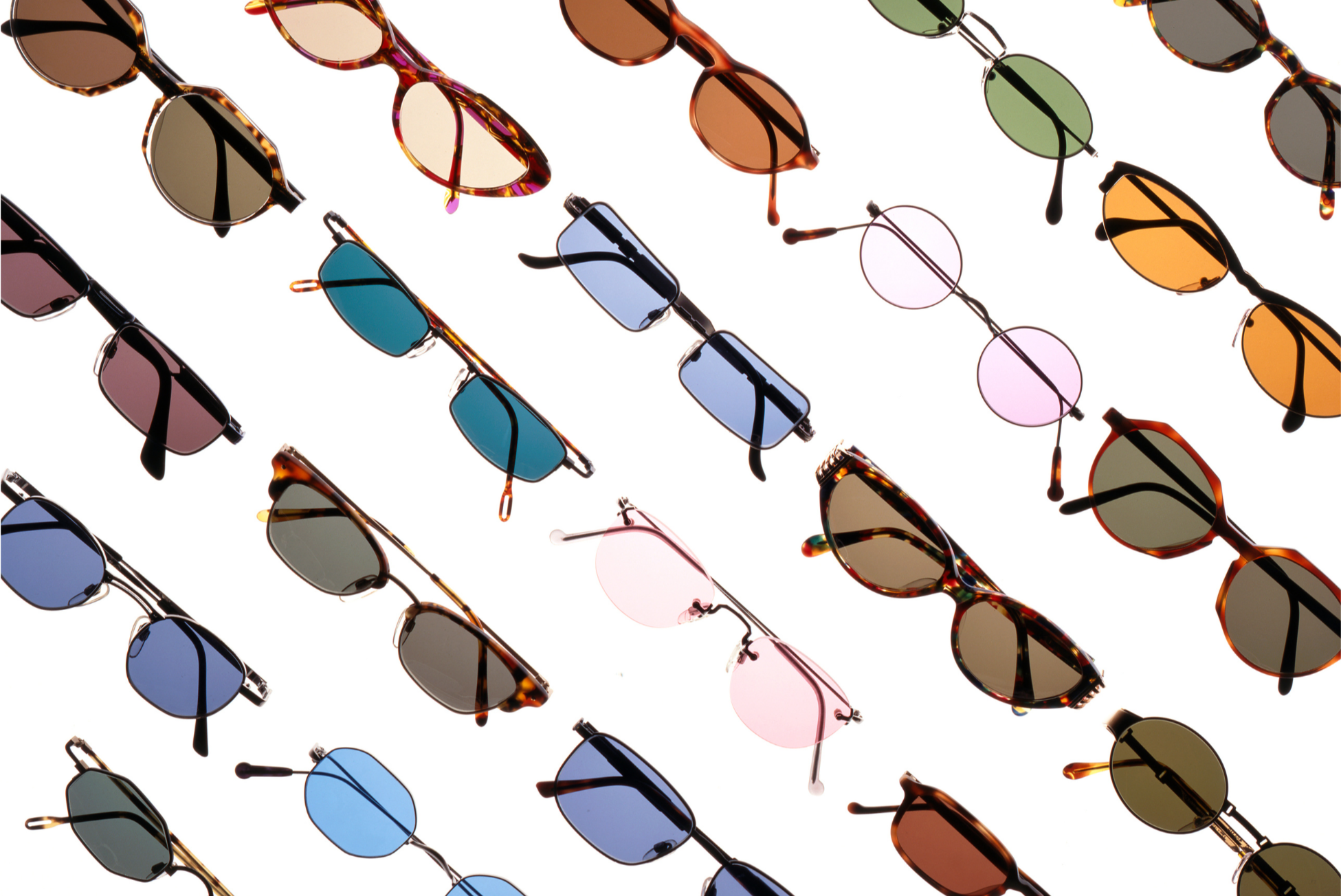
Seeing & Feeling in Color
Can lens tint influence how the day feels?
We joke about “rose-colored glasses” when someone is optimistic or even nostalgic. The phrase sounds poetic, maybe even sentimental. Light, however, is not just poetic—it is biological.
Every color we see is a wavelength of light. When that light enters the eye, it doesn’t simply form an image—it triggers neural signals that travel through areas of the brain responsible for attention, emotion, and perception. The brain constantly interprets visual information, assigning meaning to what we see and shaping our experience in the process.
Change the light and you change the input. The brain responds to what it receives.
Sunglasses do not add color to the world. They filter specific portions of the light spectrum. That filtering shifts brightness, contrast, and warmth before visual information even reaches the brain. While the world itself remains the same, the way it feels can change.
Let’s explore what happens when you choose to see the world through a particular tint.
Color and the Brain
Research in color psychology suggests that people consistently associate certain hues with emotional states. Blue is often linked to calm and control. Green is associated with balance and restoration. Warmer tones—red, amber, gold—tend to correspond with warmth and activation.
These associations aren’t pulled out of thin air. Color nudges the way our nervous system “sets the room”—not with a dramatic mood swing, but with small shifts in energy, focus, and ease. Think of it like music in a restaurant: the menu stays the same, yet the experience changes.
Over time, what we see quietly teaches us how to feel about a place.

What Tinted Lenses Actually Do
Tinted lenses filter specific wavelengths of light, altering brightness, contrast, and temperature before the visual signal reaches the brain.
When contrast increases, details sharpen. When warmth deepens, a scene feels more inviting. When glare softens, your eyes relax. Nothing “magical” happened outside—your inputs changed, so the moment shifted.
Below is how different tints tend to affect perception—and why they often feel distinct.

Gray | Neutral & Steady
Gray lenses reduce overall brightness while preserving true color balance. They lower visual intensity without distorting the scene. The result feels steady and controlled—nothing exaggerated, nothing dulled beyond necessity. It is the visual equivalent of turning the volume down without changing the song.
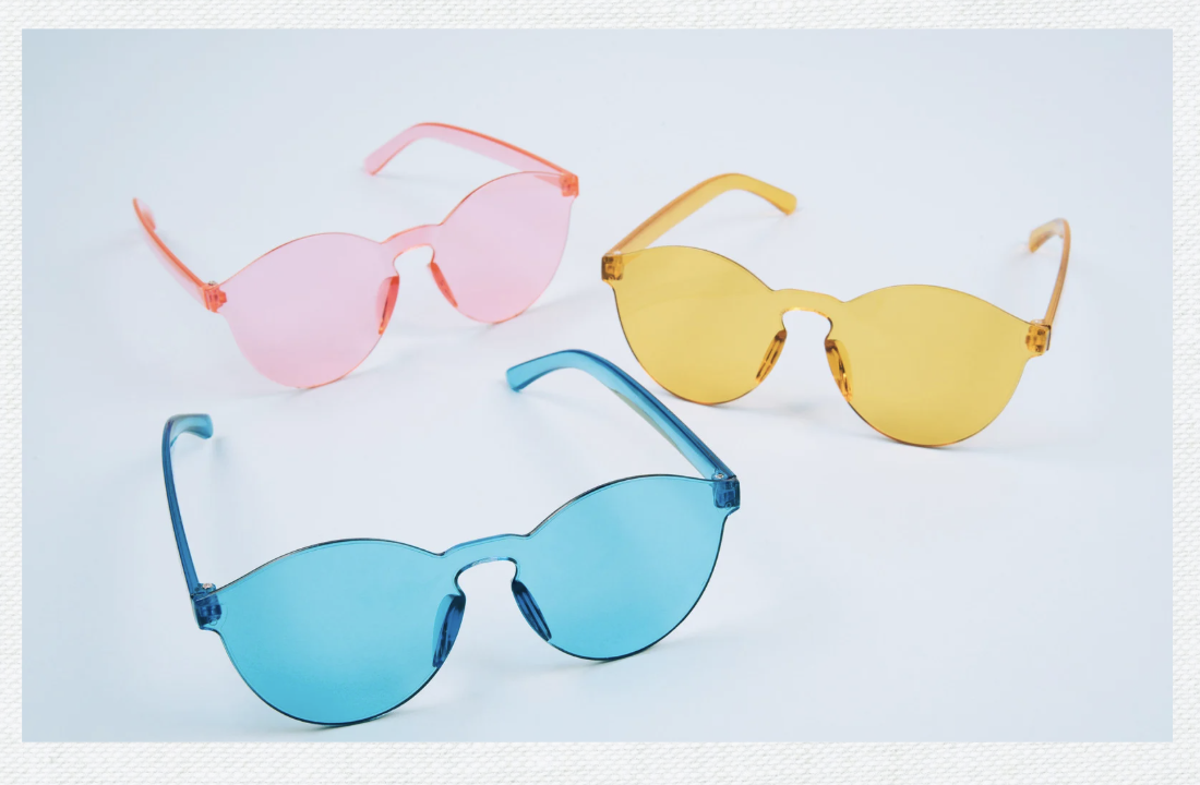
Pink | Soft & Atmospheric
Pink lenses gently warm the light without dramatically increasing contrast. Edges can feel softer, and harshness eases. The world takes on a subtle glow that reads forgiving and atmospheric. Reality stays intact, yet the tone feels kinder and slightly more romantic.
Yellow | Bright & Alert
Yellow lenses cut some blue light and boost contrast, which can make details feel sharper and more defined. That is why they show up in sports and lower-light situations. The effect often reads energizing—not louder, just clearer. Texture stands out, and focus tightens.
Amber | Sharper & Warmer
Amber lenses deepen warmth while enhancing contrast, enriching shadows and amplifying golden tones. They tend to feel more vivid than brown and more activating than gray. An ordinary afternoon can read slightly sun-drenched through amber glass.
Brown | Soft & Grounded
Brown lenses warm the light without pushing intensity too far. They reduce glare while keeping contrast feeling natural. The atmosphere often reads stable and grounded, like late-afternoon light settling across a room.
Blue | Cool & Controlled
Blue lenses cool the scene and mute warmth. The tonal shift feels cleaner and more restrained. Some experience this as calm composure, while others read it as slight emotional distance. The sensation resembles stepping into shade after standing in full sun.
Green | Balanced & Restorative
Green lenses cut glare while preserving color balance—neither too warm nor too cool. Because green sits near the center of the visible spectrum, it often feels naturally stabilizing. Many associate it with the restorative quality of trees, grass, and water—places where visual harmony feels instinctive.
Purple | Expressive & Interpretive
Purple lenses shift the visual spectrum in a way that can feel more styled than natural. Colors may read curated rather than documentary, like a scene that has been lightly art-directed. For some, the effect feels creative and cinematic. For others, it introduces a subtle distance from the everyday.
Can Lens Tint Influence Your Mood?
The honest answer is nuanced. There is no strong clinical evidence that colored sunglasses can cure sadness or manufacture happiness. Mood is layered—shaped by biology, sleep, stress, environment, and memory.
The way a scene lands still matters. If a tint softens harsh light or makes edges feel cleaner, it can gently steer how a moment unfolds. That effect is closer to adjusting lighting in a room—warmer, quieter, more focused—than flipping an emotional switch.
Shift the light and the atmosphere adjusts. Sometimes that subtle recalibration is enough. Seeing is never neutral. Neither is color.
Choosing a Tint Intentionally

Most people choose sunglasses for style. Choosing them for how you want the day to feel introduces another layer of intention.
On overstimulating days, a cooler tint may soften visual intensity. On low-energy mornings, a higher-contrast lens might sharpen the edges of the world just enough to bring it into focus. This is not a cure. It is a subtle adjustment.
Small shifts in light influence how a space feels. Sometimes that shift is enough.
A Note on Research
This article draws from findings in color psychology and affective neuroscience exploring how color exposure can influence perception and physiological response. The effects are generally subtle and context-dependent, varying by individual and environment.
Further Reading
• Elliot, A.J., & Maier, M.A. (2014). Color Psychology: Effects of Perceiving Color on Psychological Functioning. Annual Review of Psychology.
• Kaya, N., & Epps, H.H. (2004). Relationship Between Color and Emotion: A Study of College Students. College Student Journal.
• Gegenfurtner, K.R. (2003). Cortical Mechanisms of Color Vision. Nature Reviews Neuroscience.
• Valdez, P., & Mehrabian, A. (1994). Effects of Color on Emotions. Journal of Experimental Psychology.