
The Philosophy of Color: Red
Estimated reading time: 10-12 minutes
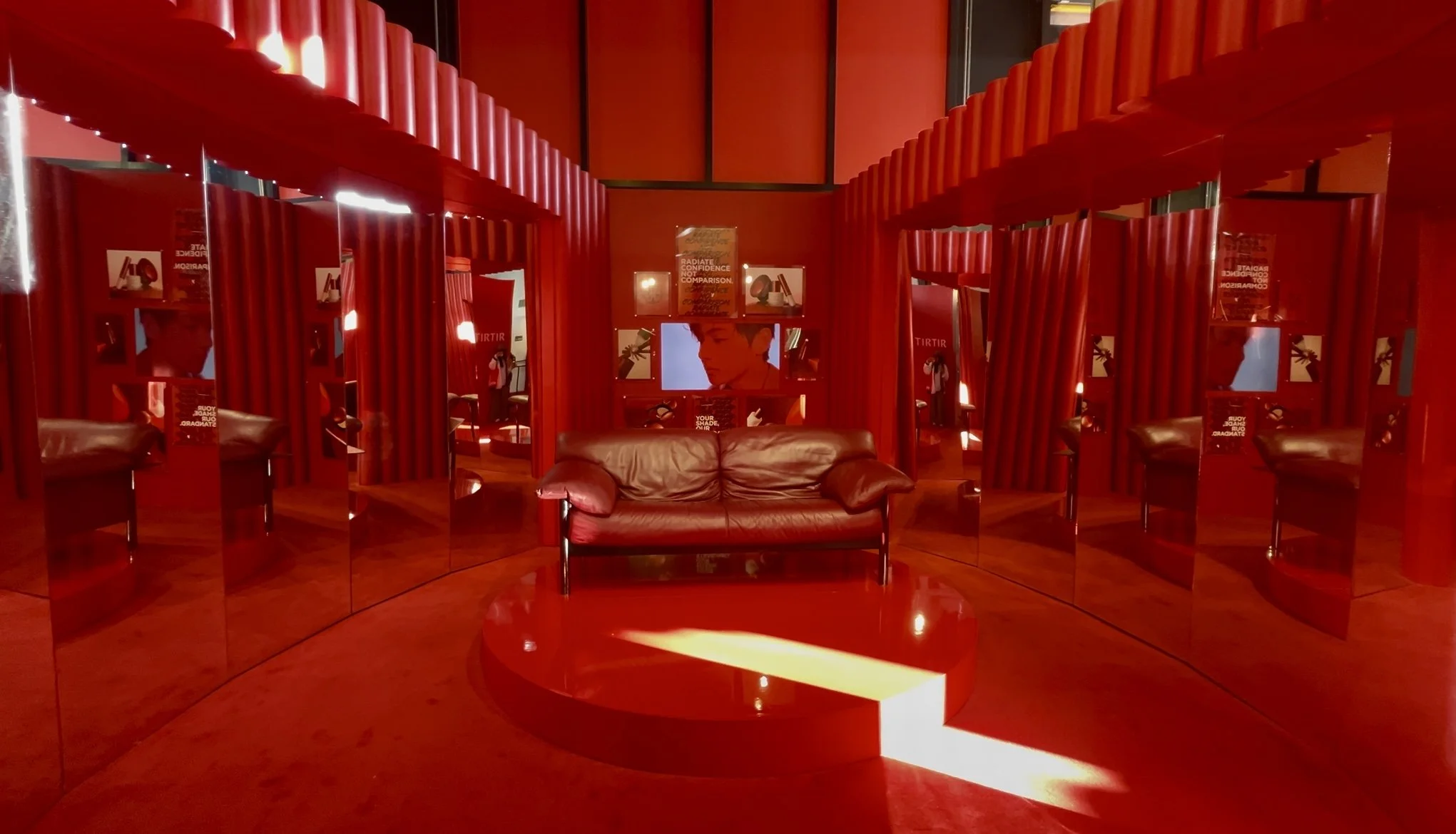
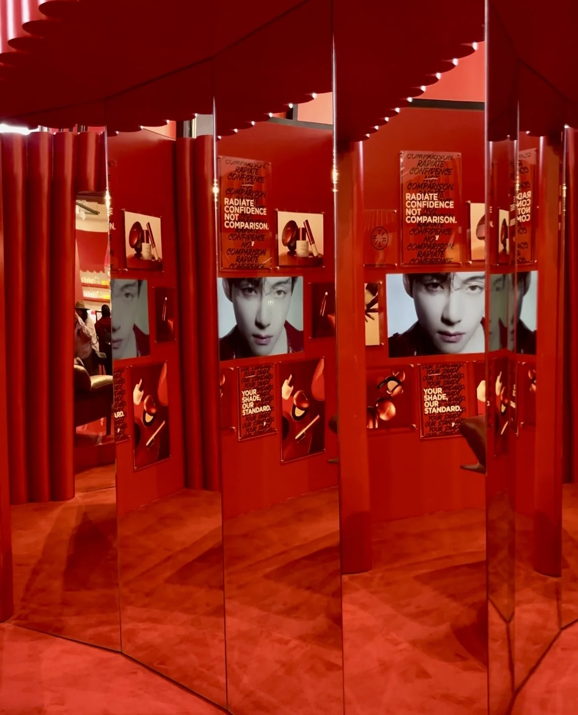
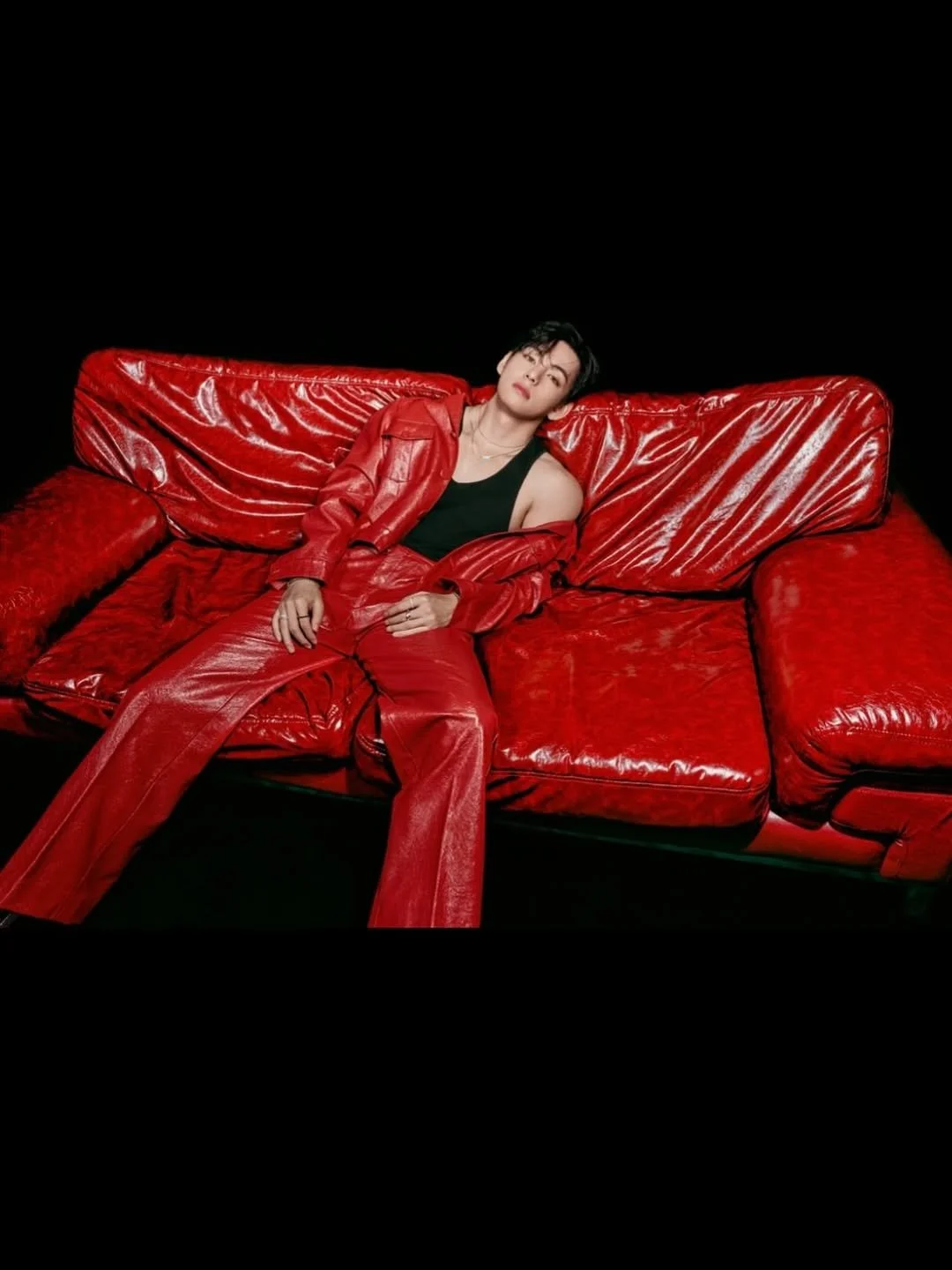
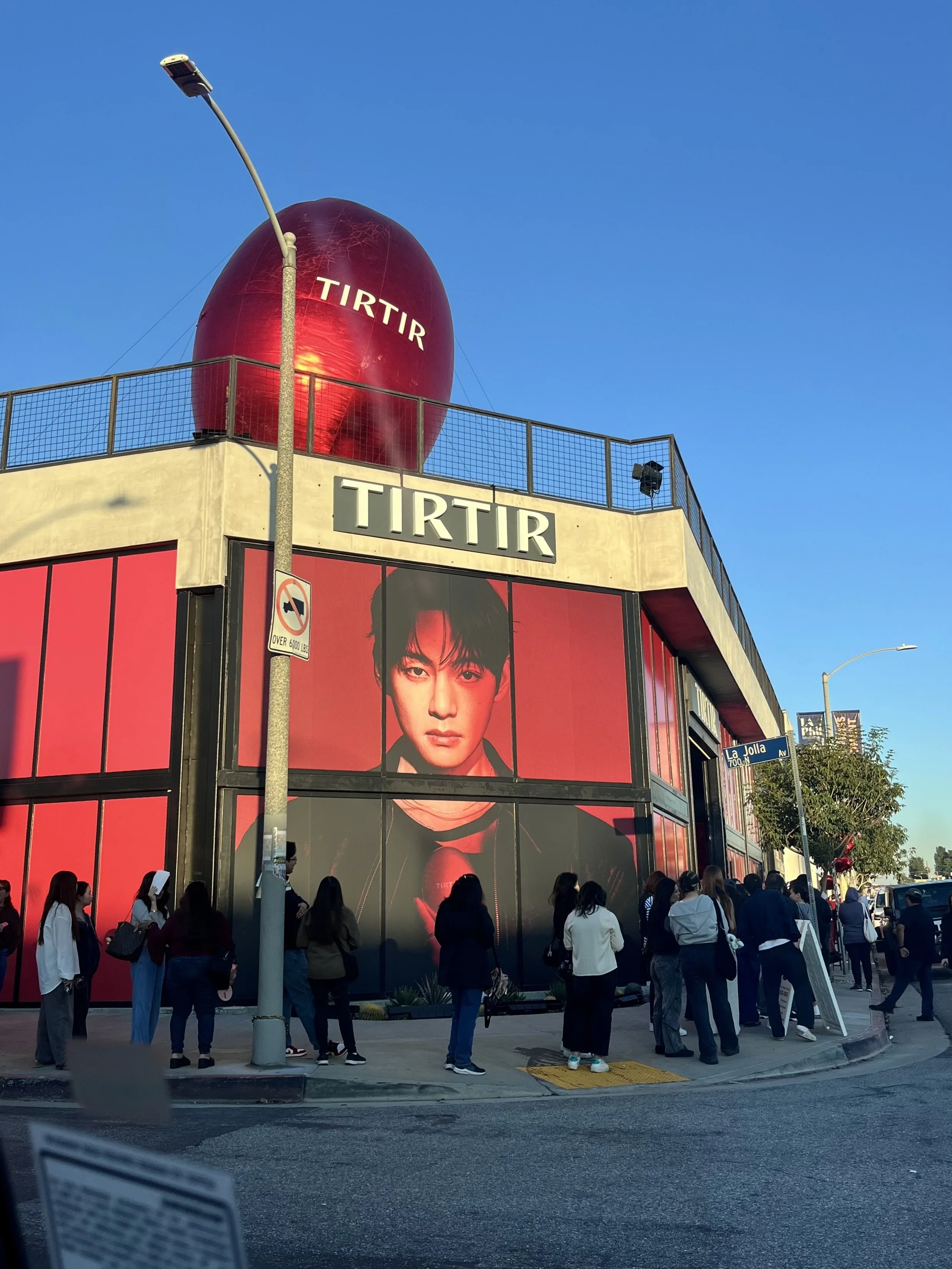

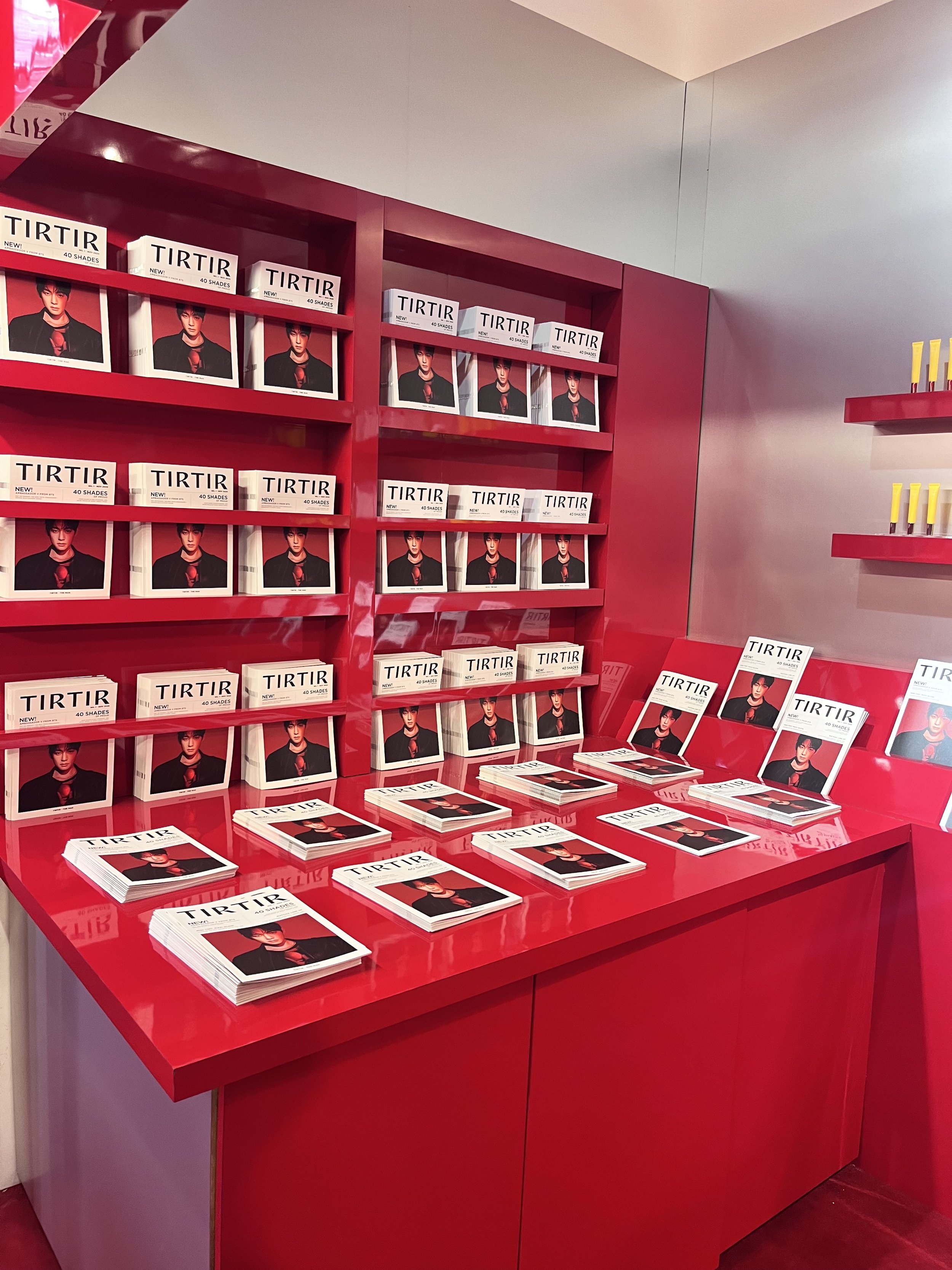
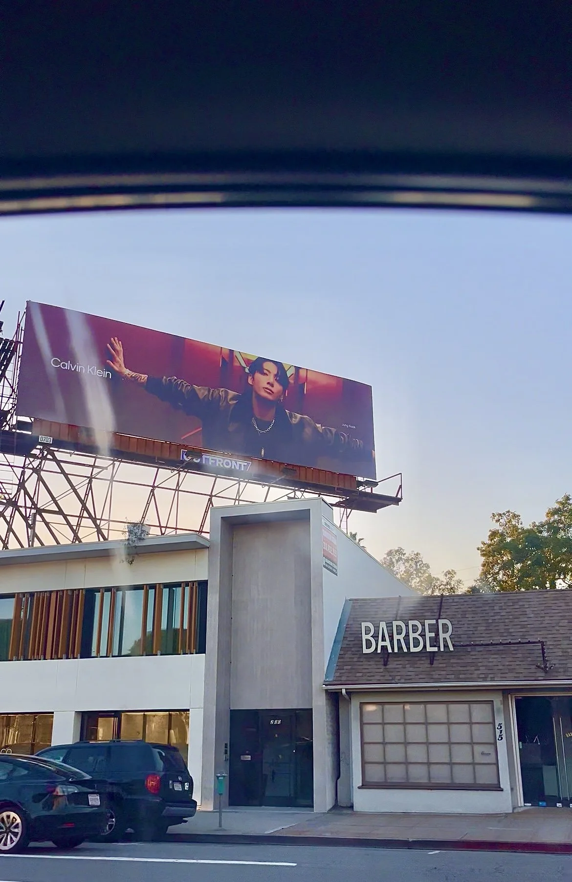
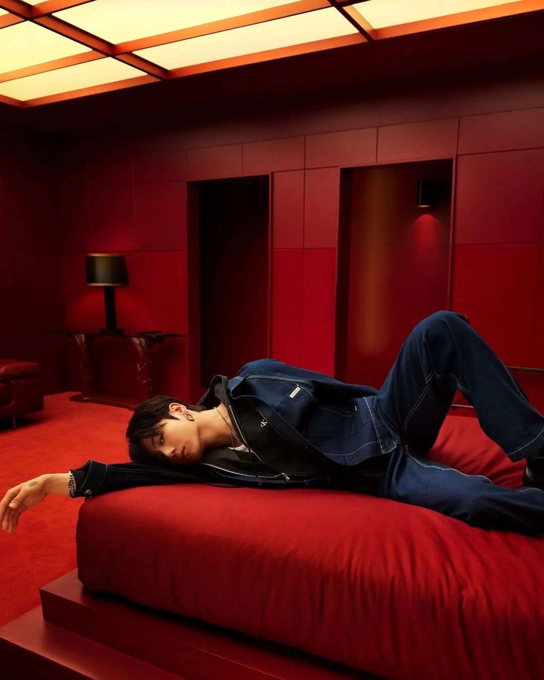
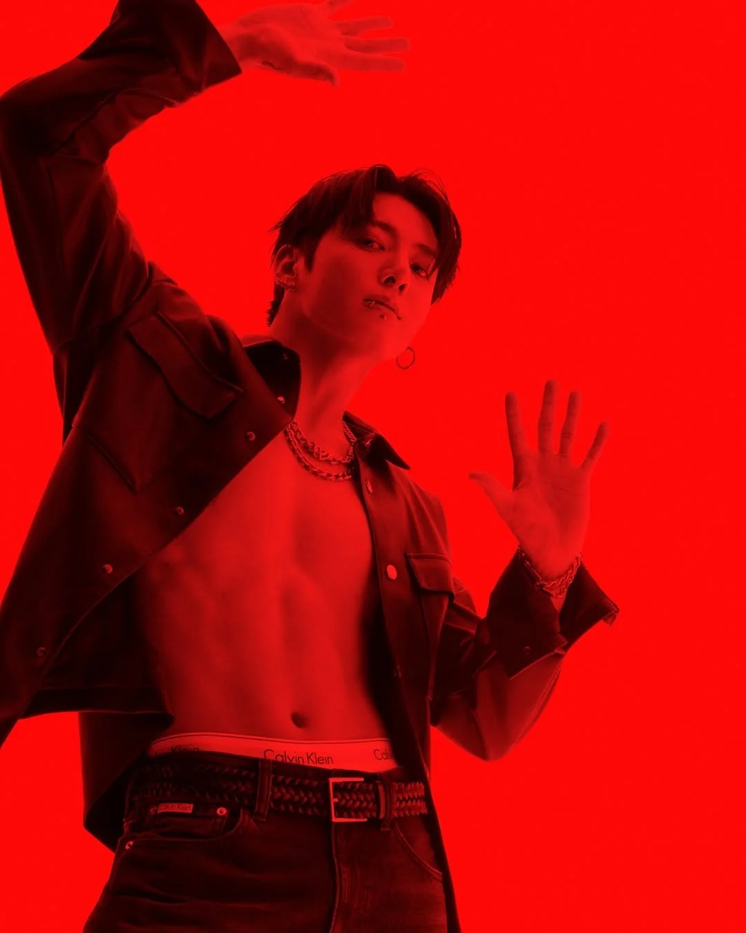
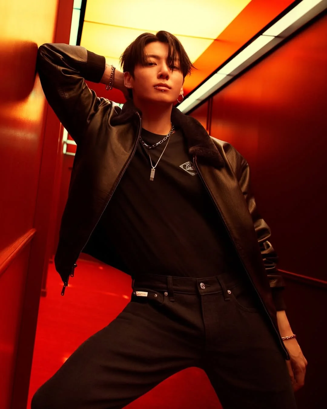
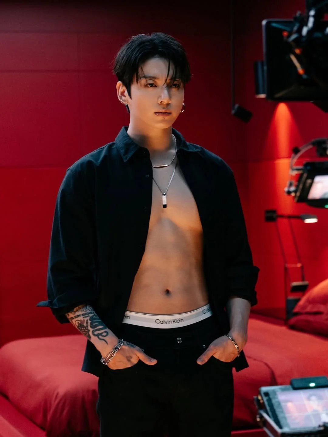
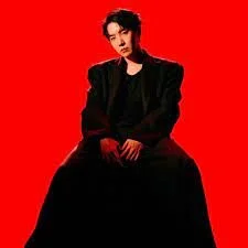
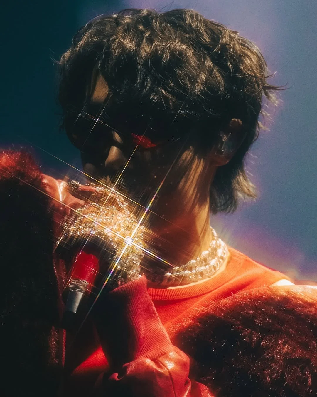
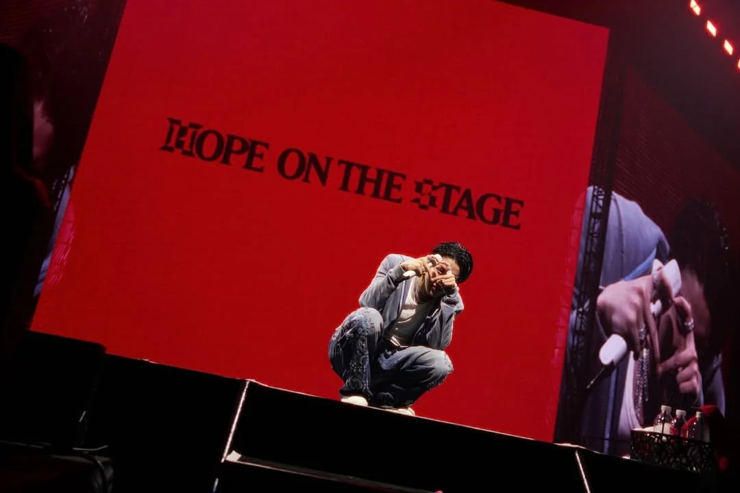
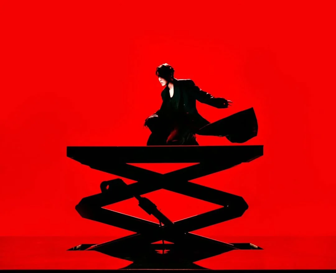
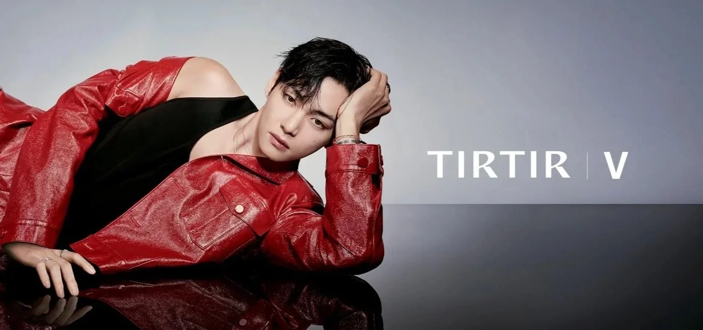
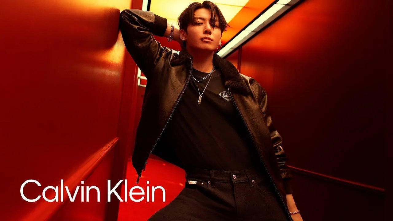
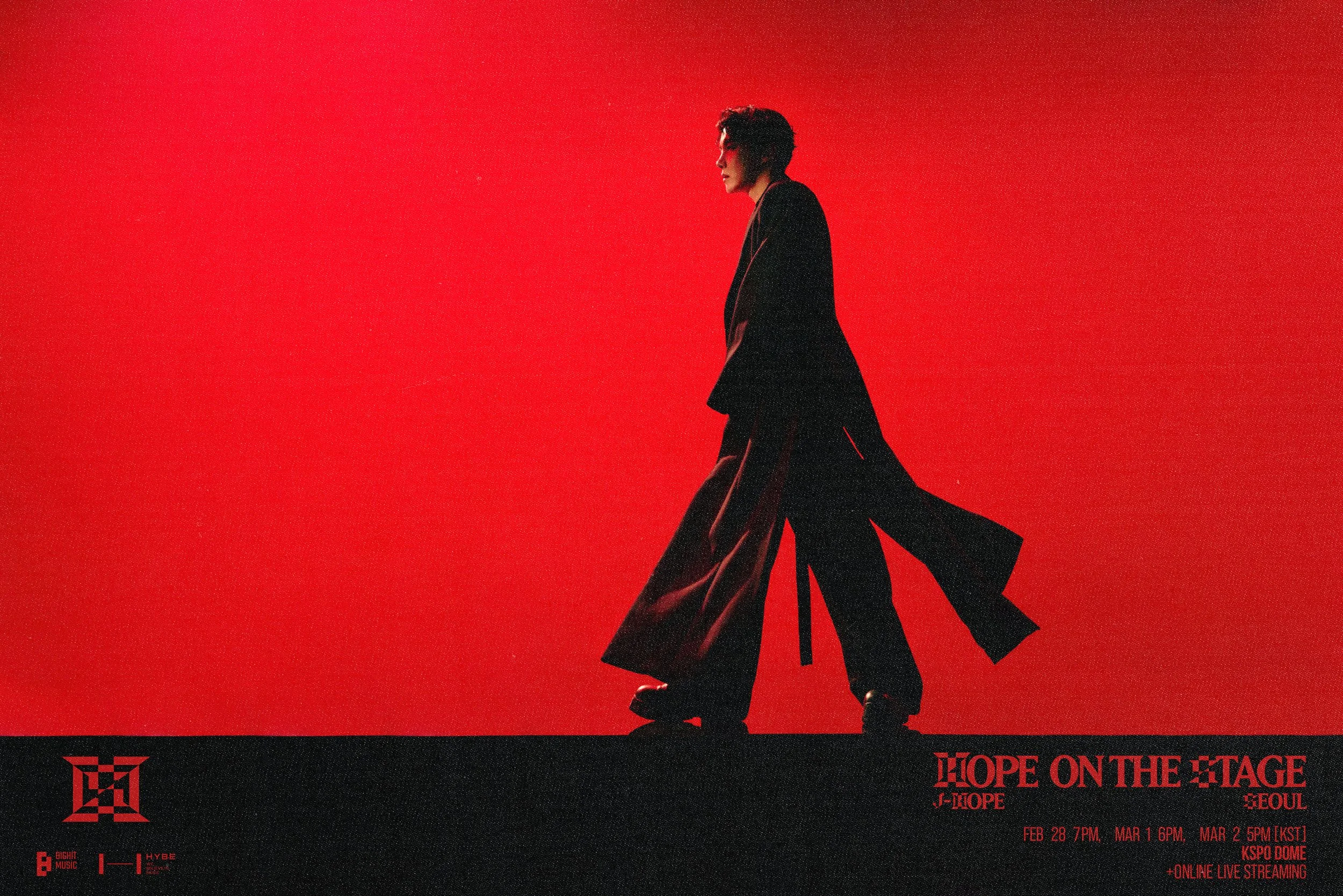
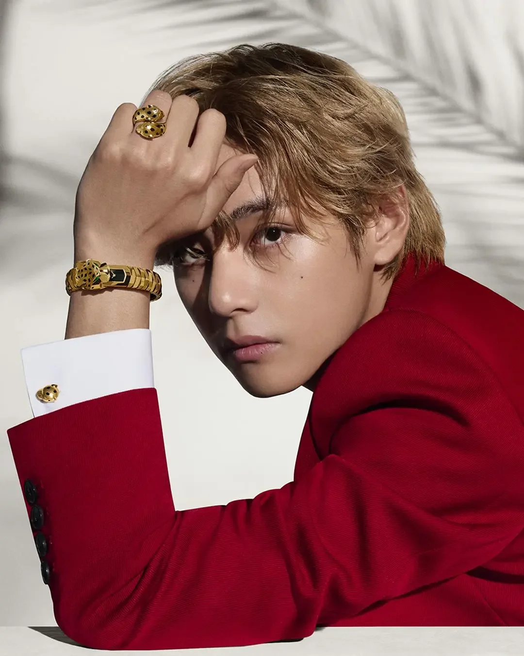
Red kept tailing me around Los Angeles like it had something to prove. It started at TIRTIR’s V pop-up—this glossy, lacquered labyrinth where every mirror insisted on handing Taehyung’s face back to me like a souvenir. Then on the drive through Hollywood, Jungkook’s Calvin Klein billboard came out of nowhere and punched the skyline in the exact same shade. Later that night—because of course—j-hope’s Hope on the Stage visuals slid onto my screen, glowing with identical red heat.
Different brands.
Different cities.
Different intentions.
One color refusing to stay in its lane.
At some point, you stop calling it coincidence and start calling it what it is: intentional design.
Red doesn’t simply appear. Red arrives. It kicks the door open, pulls up a chair, and asks, “You see me, right?”
And we do. Every time.
That weekend reminded me—again—that color directs us long before we decide anything.
So this is where our new series begins: The Philosophy of Color—a study in how hues shape emotion, culture, attention, design, and the way we move through the world.
Red moves us before we can articulate why.
Color always gets to the brain before language does.
And so we start… with the loudest one.
I. The Science of Attention
Red has the longest wavelength in the visible spectrum, which is the scientific way of saying: it’s first in line when it comes to color.
It reaches our awareness first—before shape, before meaning, before memory.
It triggers the brain’s alert systems.
Our heart rate shifts. Focus tightens.
We notice red faster, remember it longer, and react to it more instinctively than cool or quiet tones.

This is why red runs every emergency lane in modern life:
– brake lights
– hazard symbols
– STOP signs
– fire trucks
– emergency notifications
– warning beacons
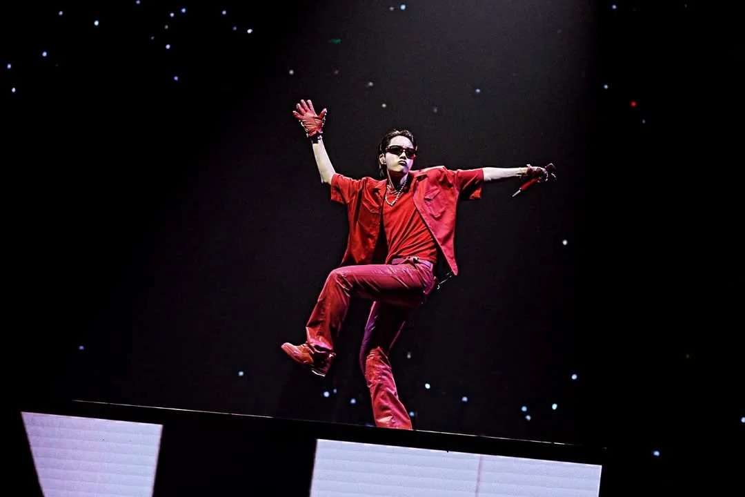
You see this play out in pop culture too—especially in BTS, where red becomes a vocabulary: J-hope’s combustion, Jungkook’s cinematic heat, V’s velvet ache.
This isn’t preference.
This is biology.
Red says: Look here.
And our bodies obey before our mind even catches up.
When a color keeps you on alert, it doesn’t just grab your attention—it steers your behavior. And red’s influence doesn’t stop at the eyes—it moves straight into appetite and energy.
II. Appetite, Energy, and Quick Decision-Making
Red doesn’t just alert us—it accelerates us.
Behavioral studies show that red quietly turns up the dial on appetite, impulsive decisions, and energy. Not enough to control us—just enough to nudge.
Fast food brands know exactly what they’re doing.
McDonald's, Jollibee, In-N-Out, Wendy’s, Raising Cane’s, KFC—they all led with red for a reason.
Red pushes people toward now, not later.
It’s not manipulation.
It’s design fluency.

Red is the color of motion. Not the color of hesitation
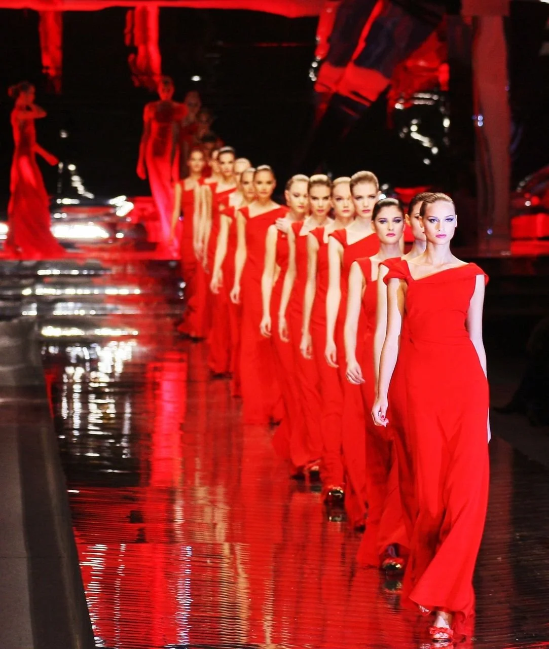
III. Red as Status and Visibility
Long before Pantone, influencers, and marketing decks, red was one of the rarest pigments on earth—difficult to source, expensive to produce, and reserved for the upper tiers of society.
Royals wore red.
Priests carried it.
Warriors marched in it.
Power communicated through it.
That legacy didn’t fade—it just updated.
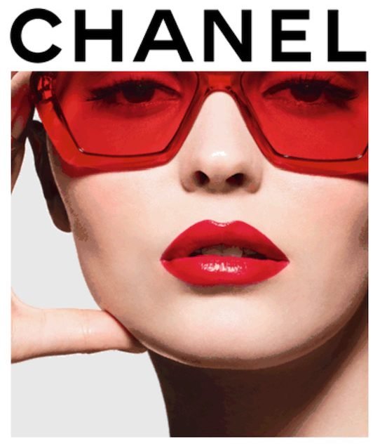
Modern luxury still bows to red:
Chanel — red lipstick, red lenses, and crimson prestige.
Dior — couture crimson on runways and archival silhouettes.
Gucci — lacquered red accessories and bold detailing.
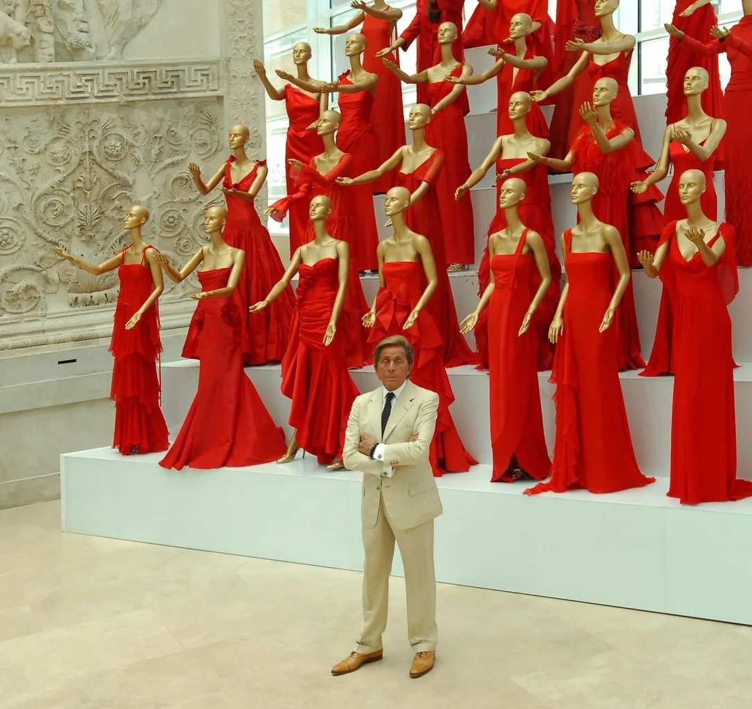
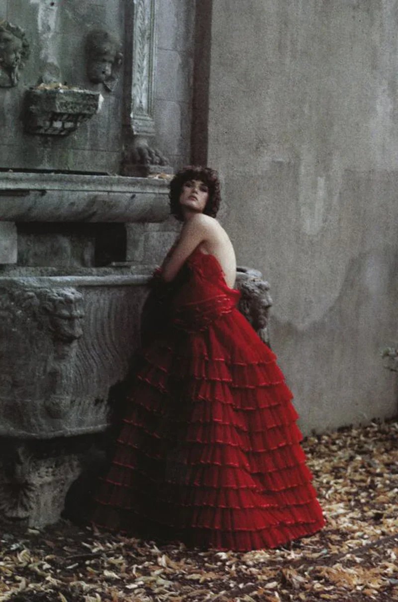
Valentino — full scarlet runways, tulle, gowns, and Rosso Valentino as a design signature.
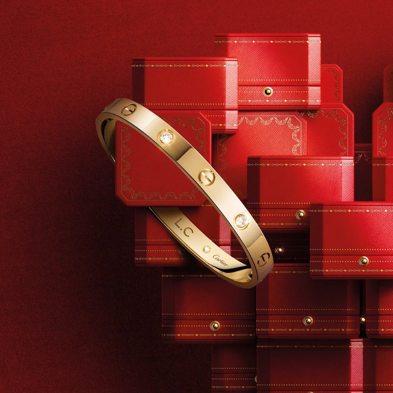
Cartier — deep-red packaging and the house’s iconic red-and-gold presentation.
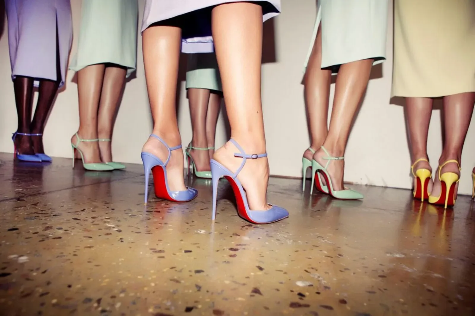
Christian Louboutin — unmistakable red soles.
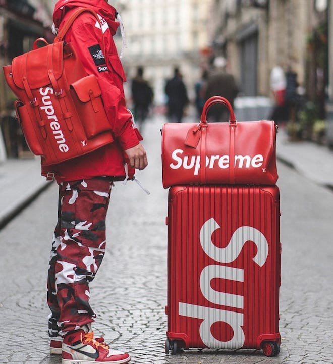
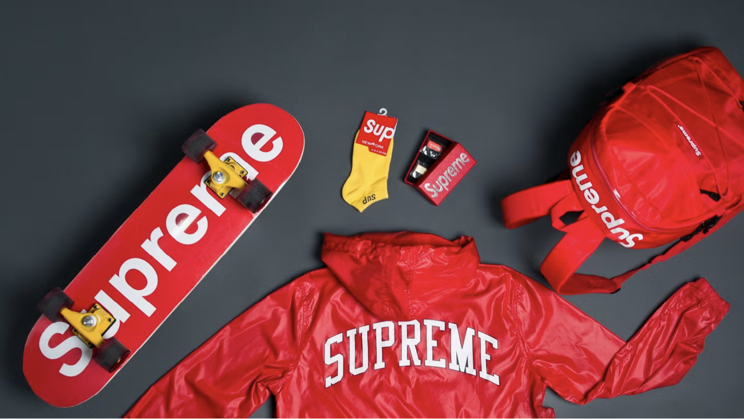
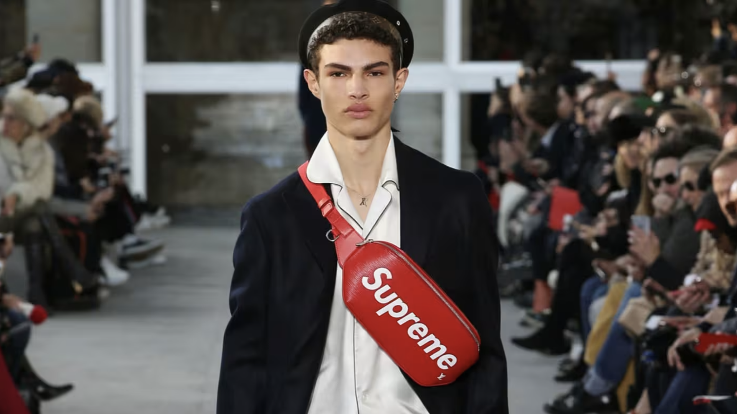
Supreme — the commanding box logo.
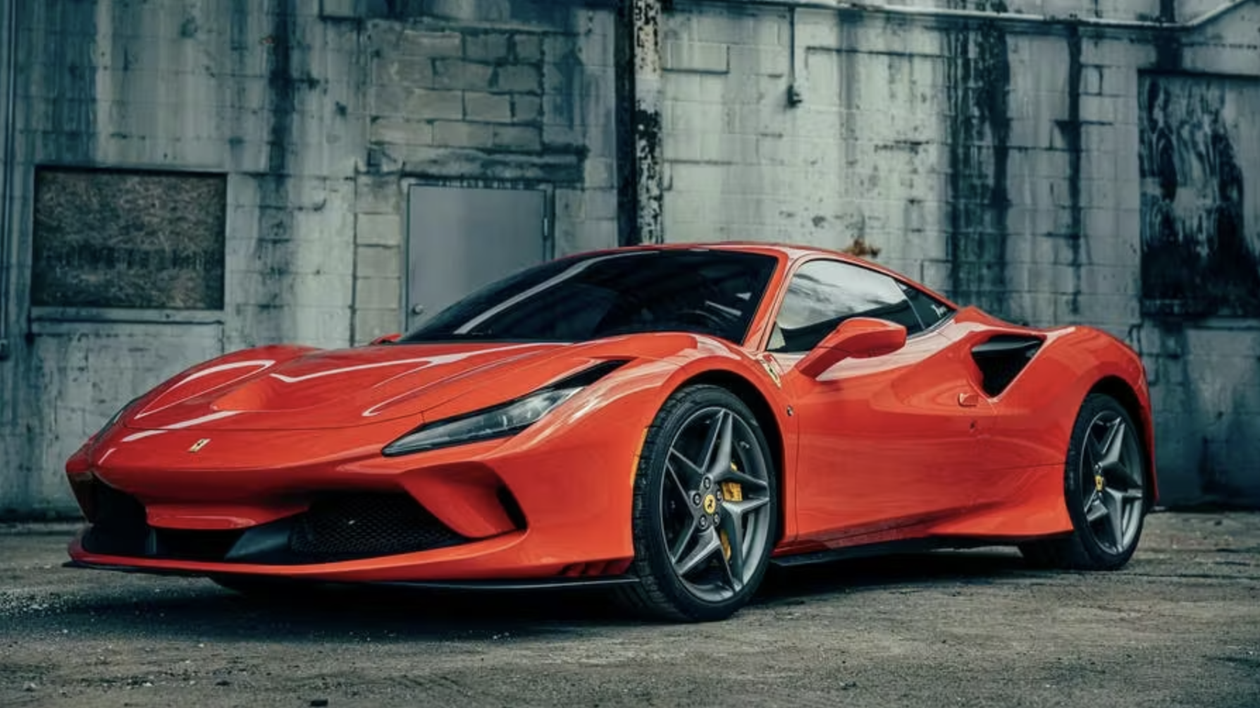
Ferrari — the high-visibility racing red that defined a brand.
These choices aren’t “aesthetic decisions.”
They’re strategic declarations.
Red doesn’t whisper. Red announces.
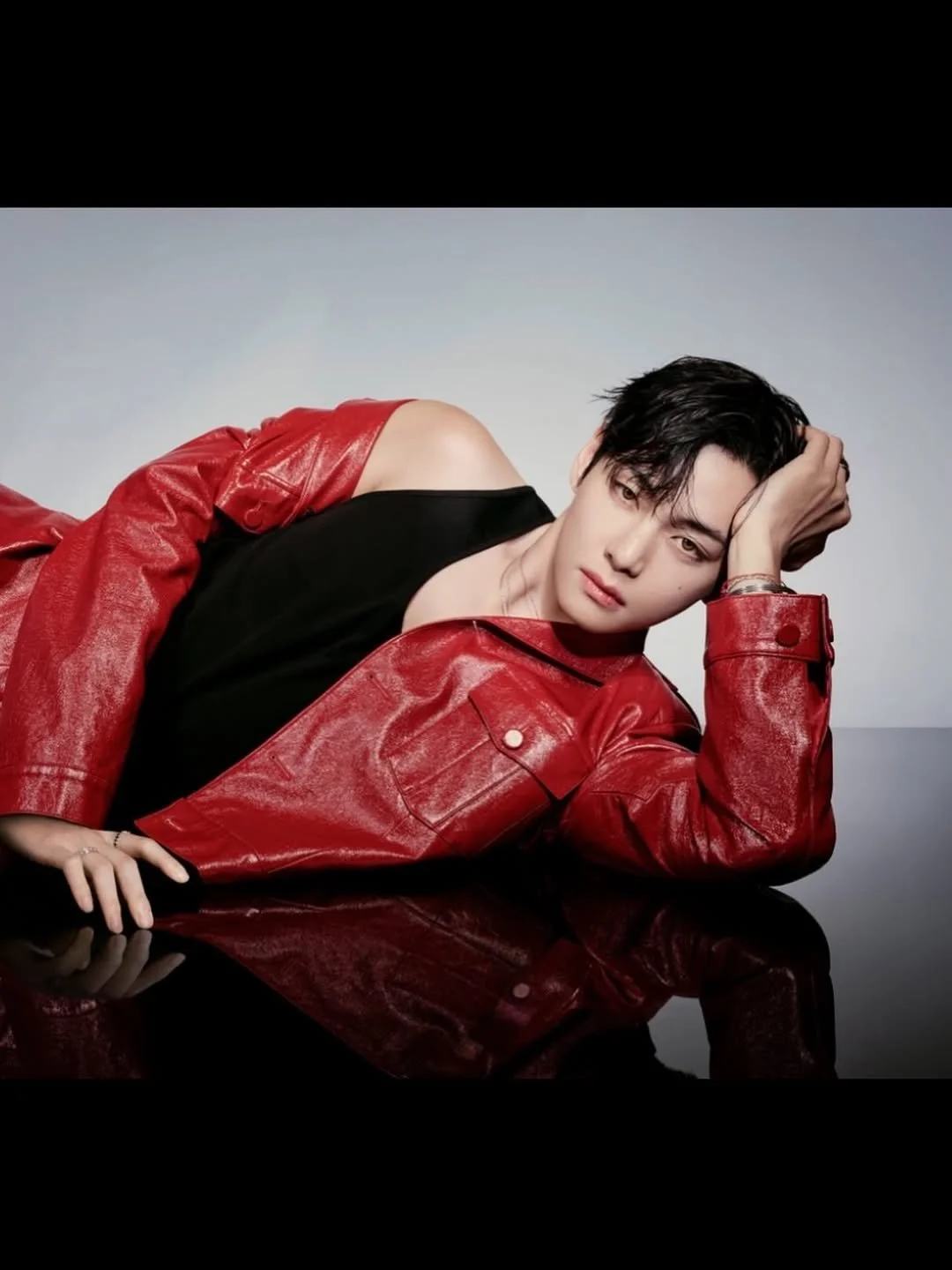
Even V’s old red jackets—from early BTS eras—carry this unspoken authority:
Not arrogance. Certainty. Presence. See me.
IV. Who Uses Red and Why
Brands use red when they want:
• Visibility
• Confidence
• Appetite
• Authority
• Urgency
• Seduction
• Warmth
• Emotional intensity
Artists use red when they want the heart to answer before the mind.
And nowhere reveals a color’s emotional truth faster than music.
So we turned to the world’s playlists.
THE GLOBAL STUDY
To map how red feels around the world, we pulled from global playlists—the songs, artists, and emotional signatures that carry red’s heat, ache, swagger, and cinematic pulse in different cultures. This curated Spotify list isn’t about genre or popularity; it’s about mood.
It’s a cross-continental sound study in how one color moves through devotion in Seoul, adrenaline in Tokyo, saffron warmth in Mumbai, late-night smoke in Los Angeles, and mythic fire everywhere in between.
Spotify Playlist: The Philosophy of Color: Red
How Cultures Sound in Red
Red behaves differently depending on where you stand on the map:
In Seoul, it's devotion and ache.
In Tokyo, it’s myth and adrenaline.
In Mumbai, it’s celebration and saffron heat.
In Lagos, it’s life-force and rhythm.
In Paris, it’s desire and theatrical fire.
In Los Angeles, it’s smoke, seduction, and late-night confession.
Different continents. Same flame.
Different languages. Same pulse.
South Korea — BTS & Solo Work
Intensity, devotion, heat, heartbeat. Red shows up across BTS’s world not just as a color, but as a signal—swagger, defiance, theatricality, longing.
MIC Drop — BTS
Red for combative swagger, heat, and explosive percussion.
Love Me Again — V
Red for yearning, velvet vocals, and late-night loneliness.
Outro: Tear — BTS
Red for heartbreak so raw it feels like a wound.
Standing Next to You — Jungkook
Red for seductive confidence, a pulse like warm skin.
Blood Sweat & Tears — BTS
Red for temptation, surrender, and baroque sensuality.
Lie — Jimin
Red for emotional self-conflict that feels feverish.
Dionysus — BTS
Red for ecstatic chaos and creative intoxication.
Arson — J-Hope
Red for literal fire—burning ambition, burning consequence.
Burning Up (Fire) — BTS
Red for explosive youth energy.
Daechwita — Agust D
Red for ferocity, dominance, and royal rage.
Epiphany — BTS
Red for the internal burning that becomes self-truth.
Wild Flower — RM (ft. Youjeen)
Red for the ache caught between explosion and restraint.
FAKE LOVE — BTS
Red for fractured passion collapsing inward.
ON — BTS
Red for militant, blood-rush readiness.
The Red Shoes — IU
Red for boldness, bewitching movement, and vintage glamour.
East Asia — South Korea, Japan, & China
(Myth, drama, cinematic emotion)
POWER — G-DRAGON
Red for attitude, charisma, and force.
Crayon — G-DRAGON
Red for chaotic neon rebellion.
紅蓮華 (Gurenge) — LiSA
Red for heroic blaze, unstoppable intensity.
のびしろ — Creepy Nuts
Red for charisma, heat, swagger.
怪物 (Kaibutsu) — YOASOBI
Red for monster-heart adrenaline.
IRIS OUT — Kenshi Yonezu
Red for emotional rupture in glowing embers.
蓮 — Lay
Red for lotus-fire symbolism and smoldering R&B.
我愛 — Tia Ray
Red for sultry confession and warm sensual richness.
South Asia & Middle East
(Celebration, devotion, dramatic color)
Jai Ho — A. R. Rahman
Red for victory dance and rhythmic heat.
Kesariya — Pritam, Arijit Singh
Red for saffron warmth and cinematic longing.
Nassam Alayna El Hawa — Fairuz
Red for desert-wind passion.
Ah W Noss — Nancy Ajram
Red for flirtation and emotional intimacy.
Nour El Ein — Amr Diab
Red for irresistible sun-burnt magnetism.
“Shava Shava” — Aadesh Shrivastava, Sudesh Bhosle, etc.
Red for wedding heat, communal joy, and celebratory rhythm.
Africa — Contemporary & Classic
(Warmth, rhythm, life-force)
Anybody — Burna Boy
Red for confidence, swagger, and Afro-fusion glow.
Suzanna — Sauti Sol
Red for romantic heat and earthy charm.
Joro — Wizkid
Red for simmering sensuality.
Agolo — Angélique Kidjo
Red for ancestral rhythm and spiritual force.
Europe — Pop, Flamenco, Classics
(Drama, desire, elegance, theatrical fire)
MALAMENTE — Rosalía
Red for flamenco danger and red-nails attitude.
Tous les mêmes — Stromae
Red for relational friction and sharp wit.
Con Te Partirò — Andrea Bocelli
Red for heart-overflowing emotion.
Team — Lorde
Red for teenage defiance and bright camaraderie.
Malemolência — Céu
Red for warm sway and warm skin.
Día de Enero — Shakira
Red for glowing devotion.
Padam Padam — Édith Piaf
Red for the sound of desire itself.
America — Jazz, Soul, Hip-Hop, R&B, Classics
(Smoke, seduction, ache, late-night red)
Dreams — Fleetwood Mac
Red for wind-swept longing and soft heartbreak.
Young & Beautiful — Lana Del Rey
Red for cinematic yearning and deep cherry melancholy.
Listen — Beyoncé
Red for fierce inner fire.
Try Again — Aaliyah
Red for cool confidence and intimate warmth.
Come Down — Anderson .Paak
Red for swagger and groove.
Gust of Wind — Pharrell Williams
Red for breezy romance.
Survivor — Destiny’s Child
Red for battle-ready strength.
Hey Ya! — Outkast
Red for explosive joy.
Lady Marmalade — Christina Aguilera, Lil’ Kim, Mýa, Pink
Red for unapologetic burlesque glamour.
Daydreamin’ — Lupe Fiasco, Jill Scott
Red for warm sunlight haze.
In a Sentimental Mood — Duke Ellington, John Coltrane
Red for velvet-red intimacy.
I Put a Spell on You — Nina Simone
Red for dark-ruby seduction.
Stroker Ace — Handsome Boy Modeling School
Red for trip-hop moodiness and nocturnal sensuality.
Set Fire to the Rain — Adele
Red for emotional combustion.
Pull Up to the Bumper — Grace Jones
Red for iconic nightlife boldness.
Angel — Massive Attack
Red for brooding shadow.
Adorn — Miguel
Red for closeness and desire.
Two Weeks — FKA twigs
Red for breathless, modern edge.
V. Why Red Endures
Red is universal not because of trend, but because of instinct.
It mirrors our internal world: pulse, heat, flame, memory.
It speaks every emotional language with frightening ease.
Devotion.
Desire.
Danger.
Celebration.
Seduction.
Rebellion.
Longing.
Truth.
Red is a shortcut to the human experience.
It’s emotion, distilled.
Conclusion
Red isn’t a color you pass by. It’s a color that insists. It speeds you up, slows you down, raises your heart rate, and hands you memories you didn’t ask for. It’s the world’s oldest attention tool, a storyteller with no need for words.
And that’s why we’re starting here — because if a single hue can influence appetite, status, culture, and emotion, imagine what the rest of the spectrum is capable of. This series will follow every shade with the respect it deserves.
Next up: Blue — the quiet one that never stays quiet for long.
Image & Video Credits
Image & Video Credits
All BTS images and videos belong to their respective owners.
Used here for non-commercial editorial commentary and cultural discussion.
• TIRTIR | V Campaign — photos & video by TIRTIR
• Calvin Klein | Jungkook Campaign — photos & video by Mert Alas for Calvin Klein
• J-Hope “Hope on the Stage” visuals — HYBE / BIGHIT MUSIC
• Red Room Pop-Up (TIRTIR Hollywood) — The Noun Magazine
• Luxury brand product images (Chanel, Dior, Gucci, Valentino, Cartier, Louboutin, Supreme) — official brand campaign materials
• Food & fast-food imagery — used for cultural analysis
• Emergency + traffic imagery — stock images
All rights belong to the original owners. Included strictly for editorial analysis.